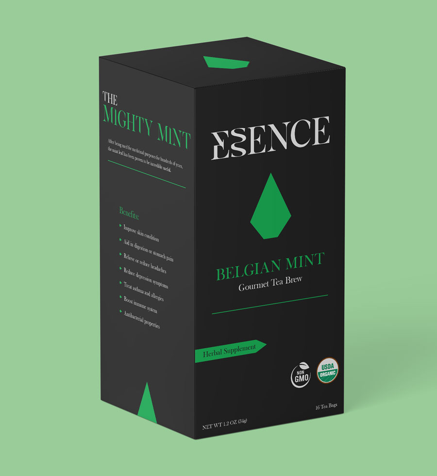

BELGIAN MINT
Identity · packaging
A gourmet tea identity and packaging system built to feel sophisticated, distinct and cohesive across four flavors.
The identity
The Essence logotype uses elegant typography to reflect the quality of the ingredients and the premium feel of the product.At its center, the stacked S forms subtly suggest steam rising from tea.


stacked S
tea steam, reduced to a mark
Flavor → form
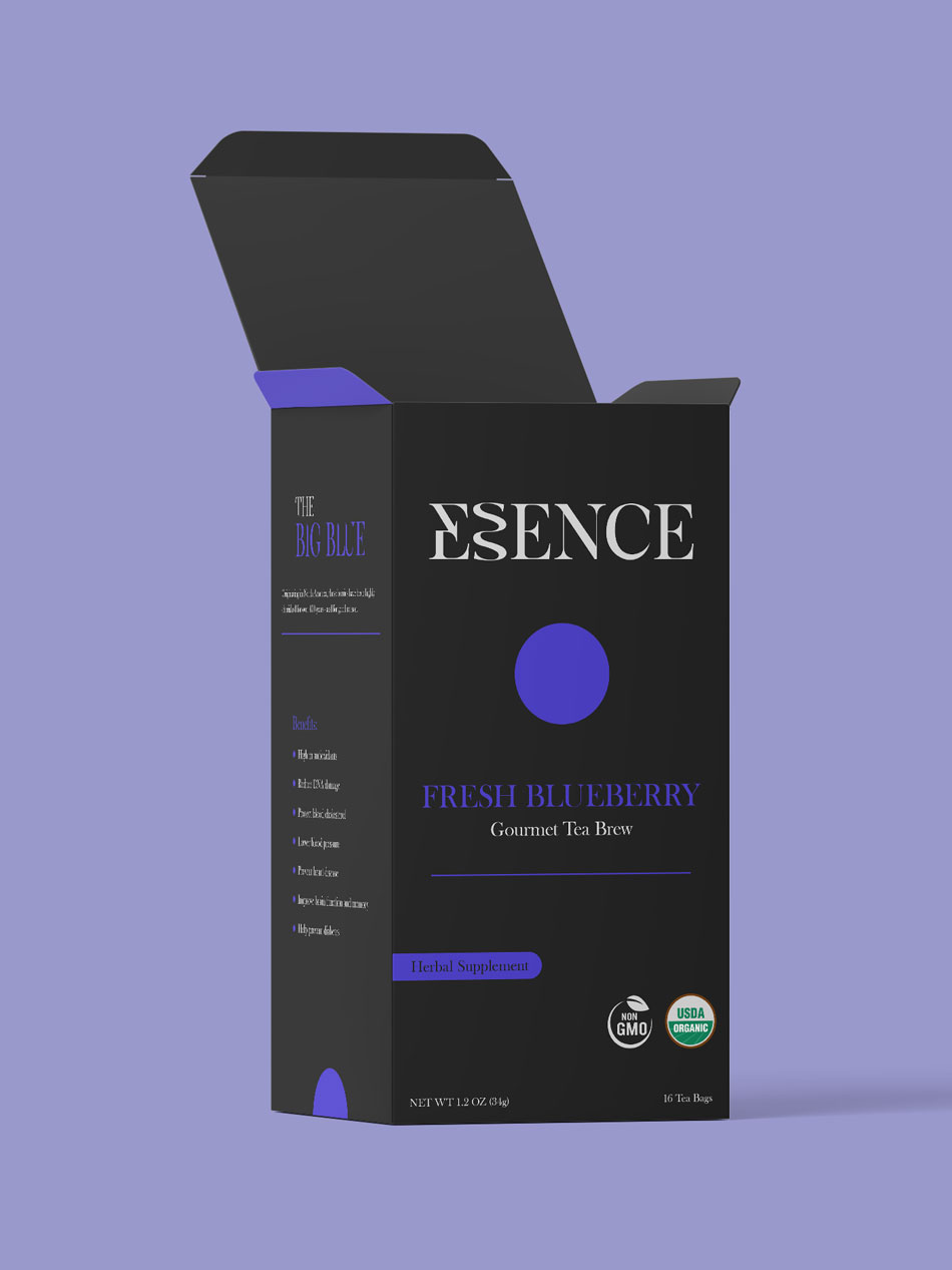
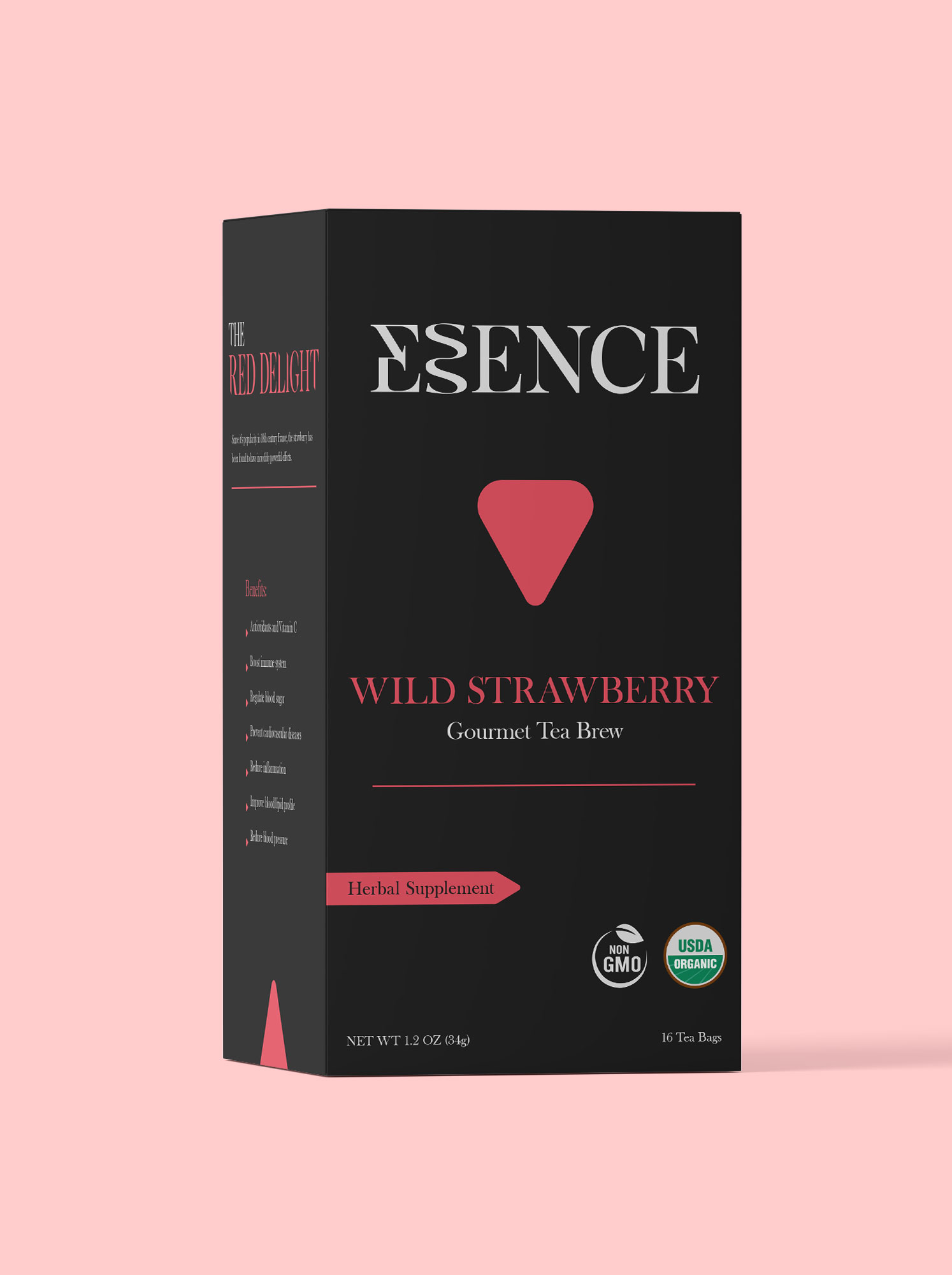
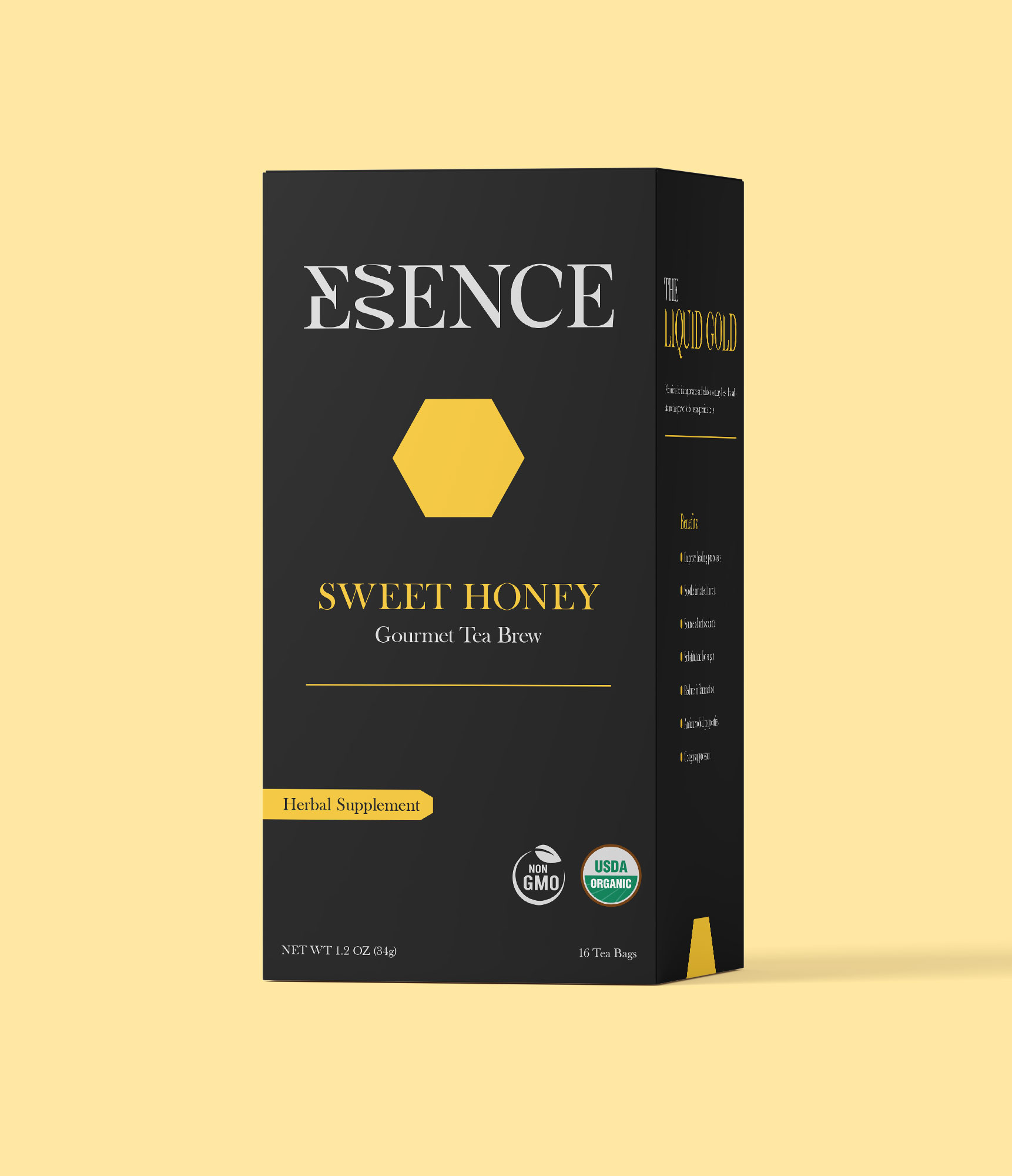
Each ingredient is reduced to a simple geometric form, paired with its own color to distinguish each flavor within the larger family.
BELGIAN MINT
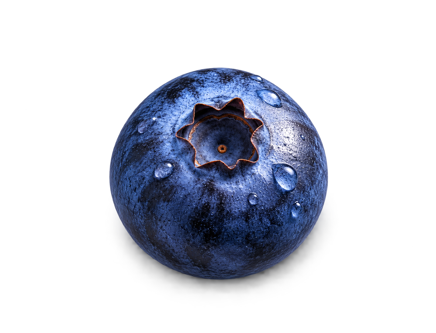

FRESH BLUEBERRY
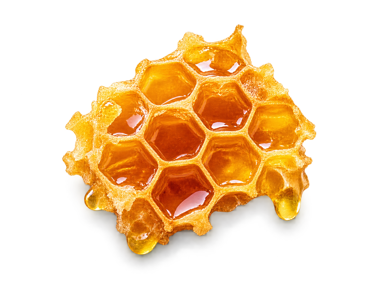

SWEET HONEY


WILD STRAWBERRY
Building the package
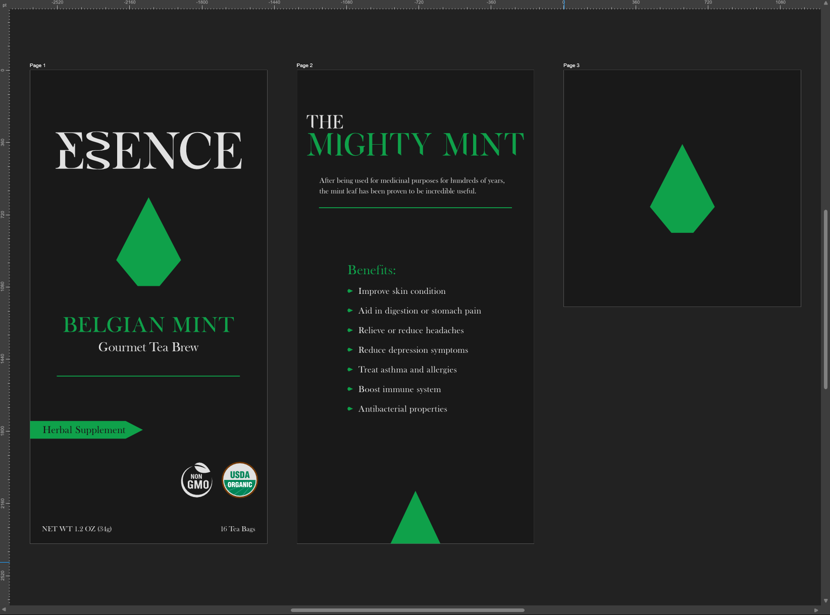
Each flavor follows the same packaging structure – from the Essence logotype and geometric mark to the product details below. Color and form change with the flavor, while the underlying system stays consistent.
Visual system
shared type / individual geometry / repeatable hierarchy
Product family