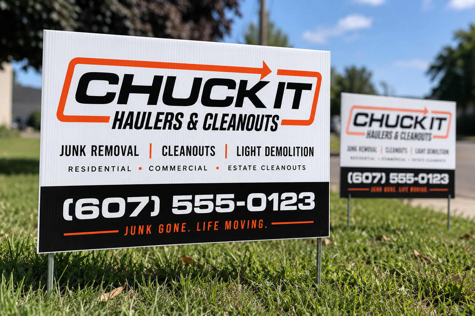
Identity refresh · used
Chuck‑It
-Haulers
A refreshed identity built to feel bold, direct, and ready to work wherever the business shows up.
- Year
- 2026
- Services
- Logo Design
Identity Refresh
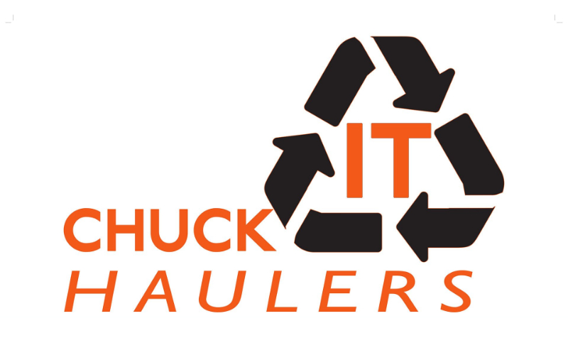
Where it started
The name stayed. The look moved forward.
Chuck-It-Haulers already had its name and an existing identity. The refresh focused on giving it a clearer, more confident visual system that could work across the business.
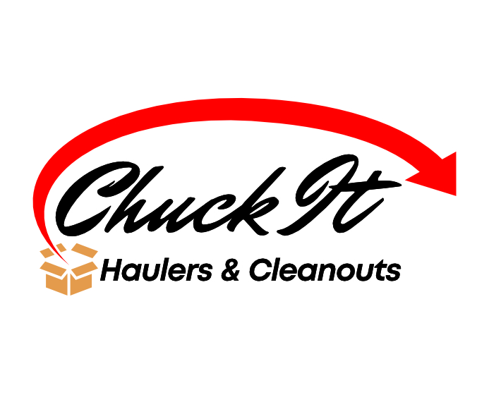
Taking shape
building something with more movement.
The early directions explored different ways to bring more movement and personality into the identity–from expressive script to heavier, more direct typography. As the direction narrowed, the arrow became part of the identity itself.
Shared direction
the details point the same way.
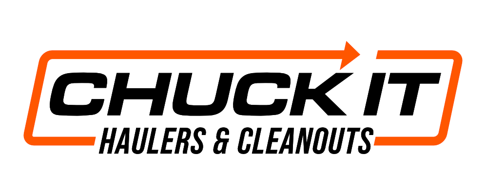
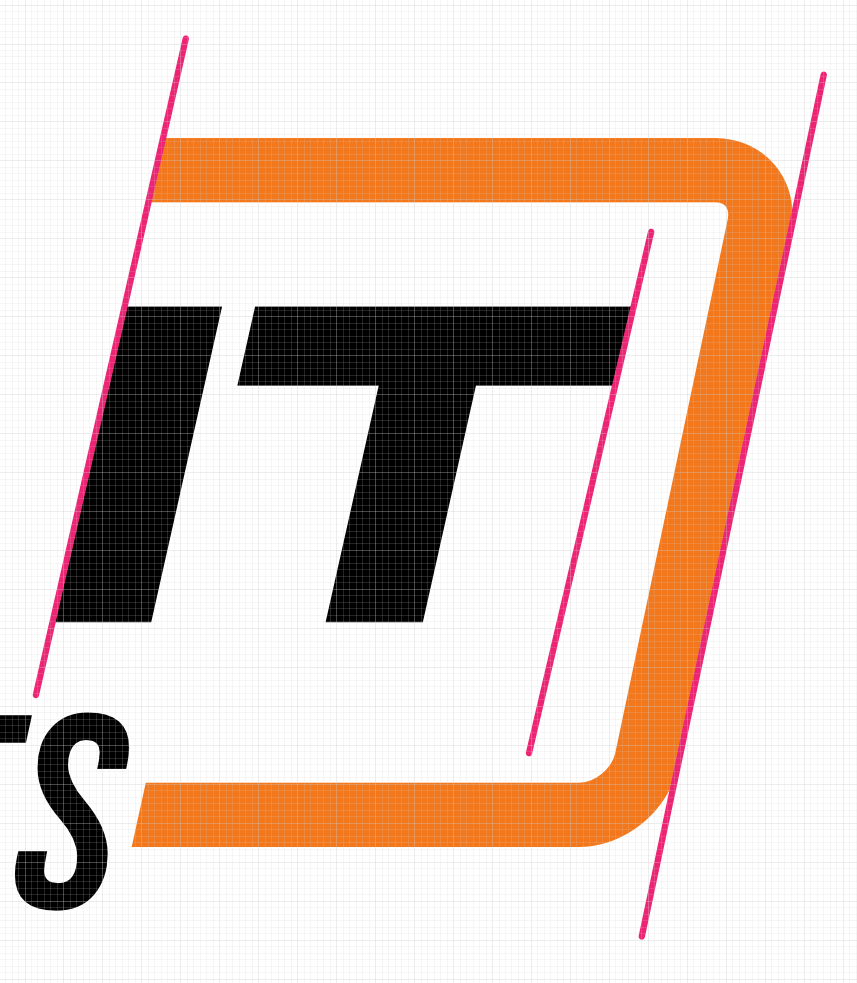
The selected direction was refined around shared angles and alignments. The italic letterforms, surrounding frame, and arrow were adjusted to carry the same forward motion through the mark.

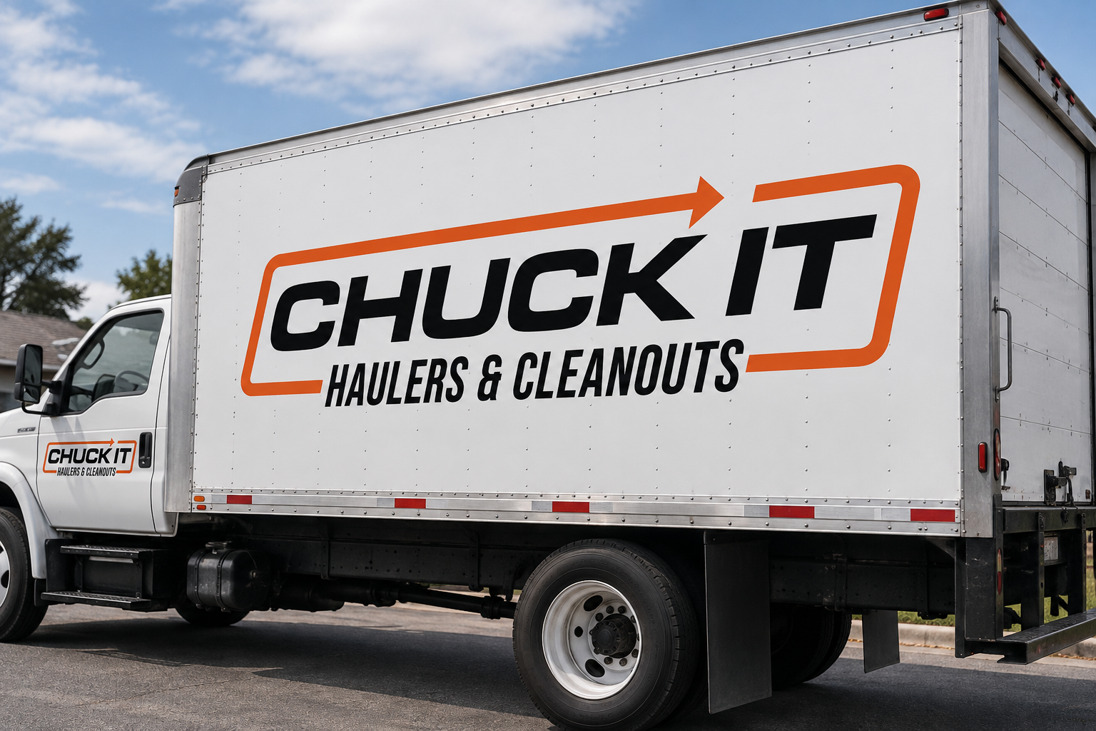
From mark to material
Built to leave the artboard.